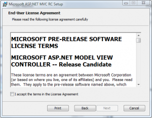
Random thought while installing the latest ASP.NET MVC build (latest to me, the latest one to the party, that is). Here’s the usual EULA acceptance form:

Now, this form doesn’t do it, but I’ve seen some (the WoW EULA, for example) that make you actually scroll down to the bottom before accepting the terms, which thankfully doesn’t have a timer attached to it to ensure you actually made the pretense of reading them.
As a compromise, I’d like to see a form that shows the “I accept the terms in the License Agreement” checkbox regardless of the status of the scrollbar, but if the bar’s at the top, adds the word “blindly” to the label.
Leave a Reply